
Good interfaces.
Built at velocity.
React components with a considered point of view. Start with beautiful defaults, make the theme yours, and get straight to building.
npm install @velocityuikit/velocityuiGood things, in progress.
1/3 completeTry the tabs. Complete a task. Add your own.
A small dependency.
A big head start.
Small details. Big difference.
Real components, ready to explore. Try the states, then take the code.
Everything in its right place.
A clear view of what matters.
You’re all caught up.
Your latest activity appears here.
A space that feels like you.
Fine-tune every detail.
A different feel. The same foundation.
Explore ten themes and three densities. Take your favorite into your project.
Your choices apply across the site and stay saved in this browser.
import '@velocityuikit/velocityui/dist/style.css'

// Apply to your root layout, or scope to a section.
<div className="vui-theme-default vui-density-comfortable">
  {/* Your components */}
</div>Less setup. More possibility.
The essentials, thoughtfully put together.
So you can focus on what makes your product yours.
Fits your stack
React and TypeScript. Scoped CSS Modules. A familiar API that stays out of your way.
Your visual language
Ten themes, three densities, and CSS variables for the details that make it yours.
Considered interactions
Keyboard navigation, visible focus, accessible labels, and respect for reduced motion.
Only what you need
Tree-shakeable JavaScript with no third-party runtime dependencies beyond React.
A head start on your next screen.
Explore complete layouts built with the same components.
 Explore example
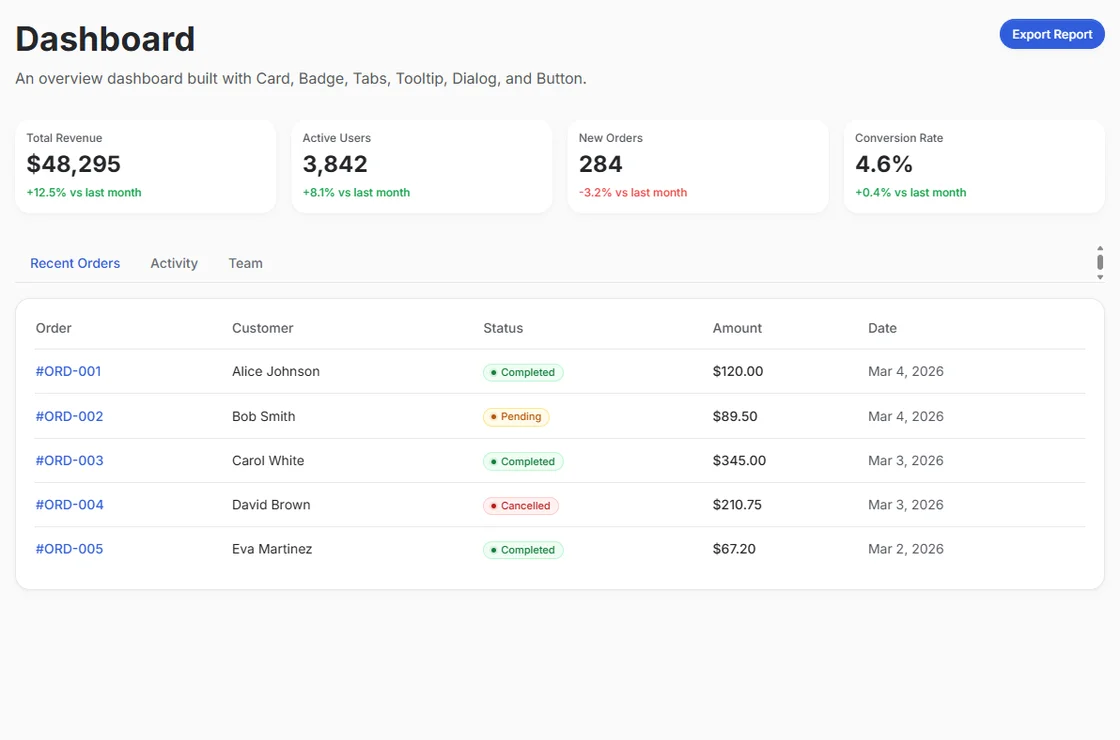
 A clearer overview
A clear view of revenue, recent orders, and the people behind them.
 Explore example
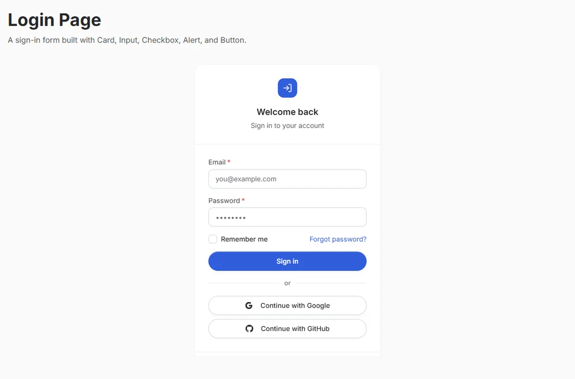
 A warm welcome
A welcoming sign-in flow with clear fields, validation, and helpful feedback.
 Explore example
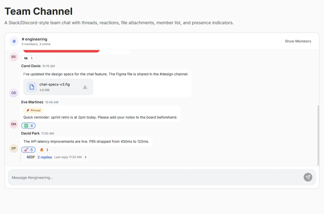
 A better conversation
Bring the team into one conversation with channels, threads, and reactions.
Your next idea starts here.
One install. A whole new starting point.
Start building Building with AI? Grab the agent guide